pacman::p_load(GGally, parallelPlot, tidyverse)Hands-on Exercise 5d: Visual Multivariate Analysis with Parallel Coordinates Plot
What Will I Learn?
By the end of this hands-on exercise, I will gain hands-on experience on:
plotting statistic parallel coordinates plots by using ggparcoord() of GGally package,
plotting interactive parallel coordinates plots by using parcoords package, and
plotting interactive parallel coordinates plots by using parallelPlot package.
Overview
Parallel coordinates plot is a data visualisation specially designed for visualising and analysing multivariate, numerical data. It is ideal for comparing multiple variables together and seeing the relationships between them. The strength of parallel coordinates isn’t in their ability to communicate some truth in the data to others, but rather in their ability to bring meaningful multivariate patterns and comparisons to light when used interactively for analysis.
Getting Started
Installing and launching R packages
For this exercise, the GGally, parcoords, parallelPlot and tidyverse packages will be used.
Preparing data
In this hands-on exercise, the World Happinees 2018 data will be used.
wh <- read_csv("data/WHData-2018.csv")Plotting Static Parallel Coordinates Plot
Plotting a simple parallel coordinates
Code chunk below shows a typical syntax used to plot a basic static parallel coordinates plot by using ggparcoord().
ggparcoord(data = wh,
           columns = c(7:12))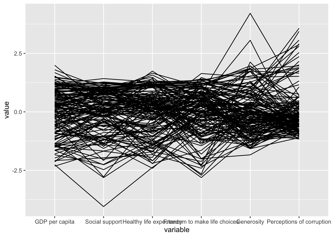
Plotting a parallel coordinates with boxplot
The basic parallel coordinates failed to reveal any meaning understanding of the World Happiness measures. In this section, you will learn how to makeover the plot by using a collection of arguments provided by ggparcoord().
ggparcoord(data = wh,
           columns = c(7:12),
           groupColumn = 2,
           scale = "uniminmax",
           alphaLines = 0.2,
           boxplot = TRUE,
           title = "Parallel Coordinates Plot of World Happines Variables")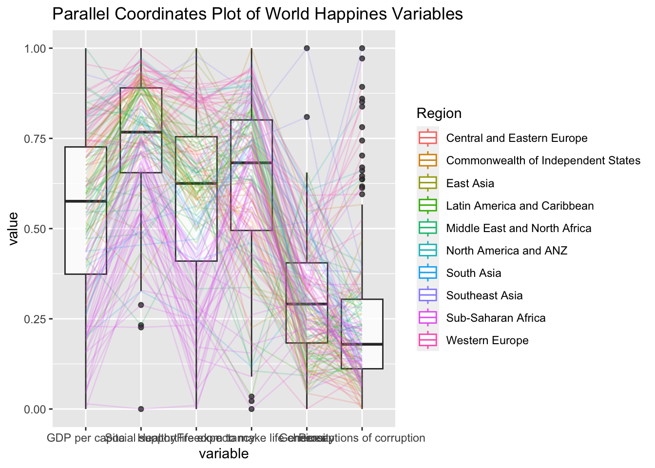
Things to learn from the code chunk above.
groupColumnargument is used to group the observations (i.e. parallel lines) by using a single variable (i.e. Region) and colour the parallel coordinates lines by region name.scaleargument is used to scale the variables in the parallel coordinate plot by usinguniminmaxmethod. The method univariately scale each variable so the minimum of the variable is zero and the maximum is one.alphaLinesargument is used to reduce the intensity of the line colour to 0.2. The permissible value range is between 0 to 1.boxplotargument is used to turn on the boxplot by using logicalTRUE. The default isFALSE.titleargument is used to provide the parallel coordinates plot a title.
Parallel coordinates with facet
In the code chunk below, facet_wrap() of ggplot2 is used to plot 10 small multiple parallel coordinates plots. Each plot represent one geographical region such as East Asia.
ggparcoord(data = wh,
           columns = c(7:12),
           groupColumn = 2,
           scale = "uniminmax",
           alphaLines = 0.2,
           boxplot = TRUE,
           title = "Multiple Parallel Coordinates Plots of World Happines Variables by Region") +
  facet_wrap(~ Region)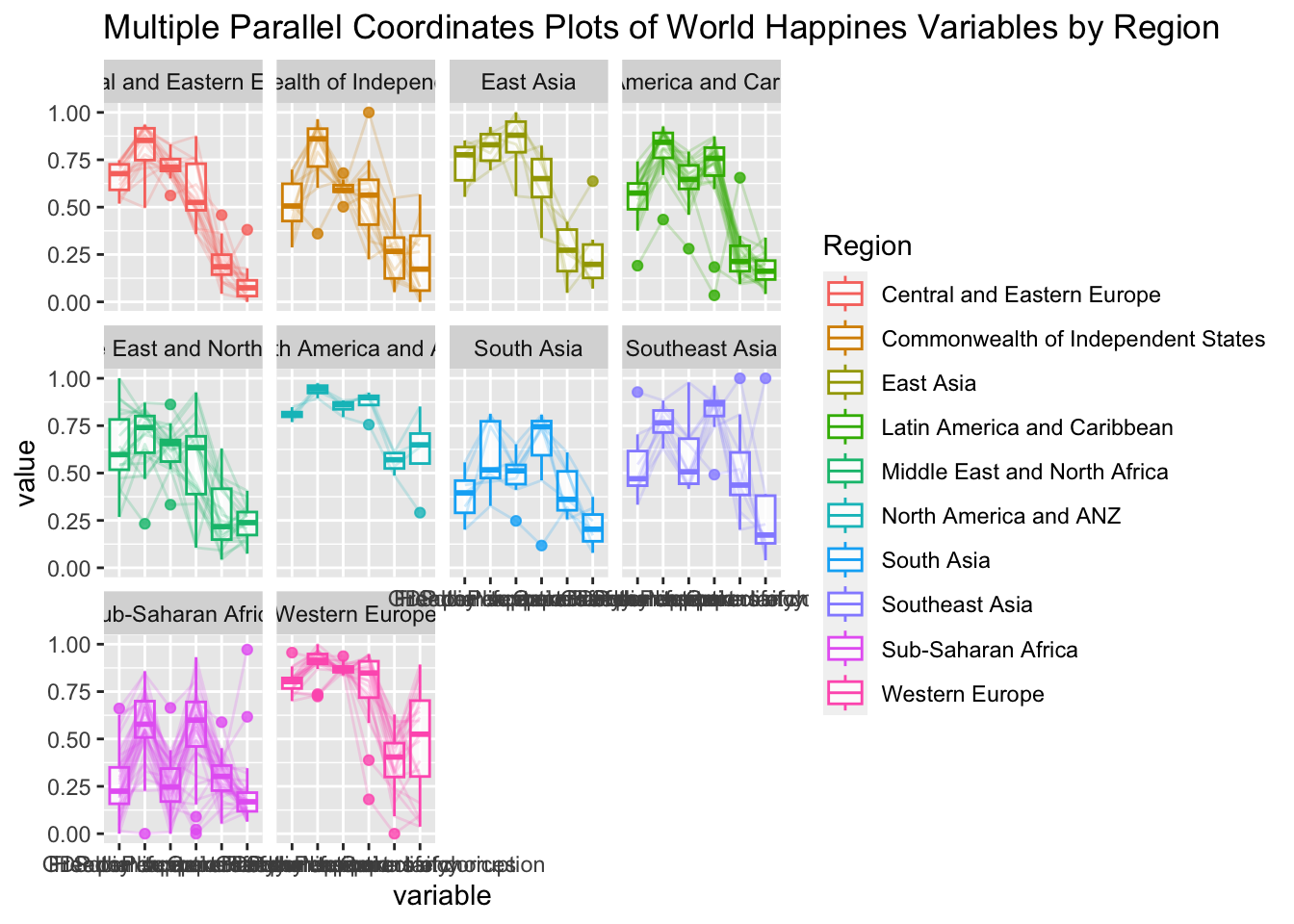
One of the aesthetic defect of the current design is that some of the variable names overlap on x-axis.
Rotating x-axis text label
We can rotate axis text labels using theme() function in ggplot2 as shown in the code chunk below.
ggparcoord(data = wh,
           columns = c(7:12),
           groupColumn = 2,
           scale = "uniminmax",
           alphaLines = 0.2,
           boxplot = TRUE,
           title = "Multiple Parallel Coordinates Plots of World Happines Variables by Region") +
  facet_wrap(~ Region) +
  theme(axis.text.x = element_text(angle = 30))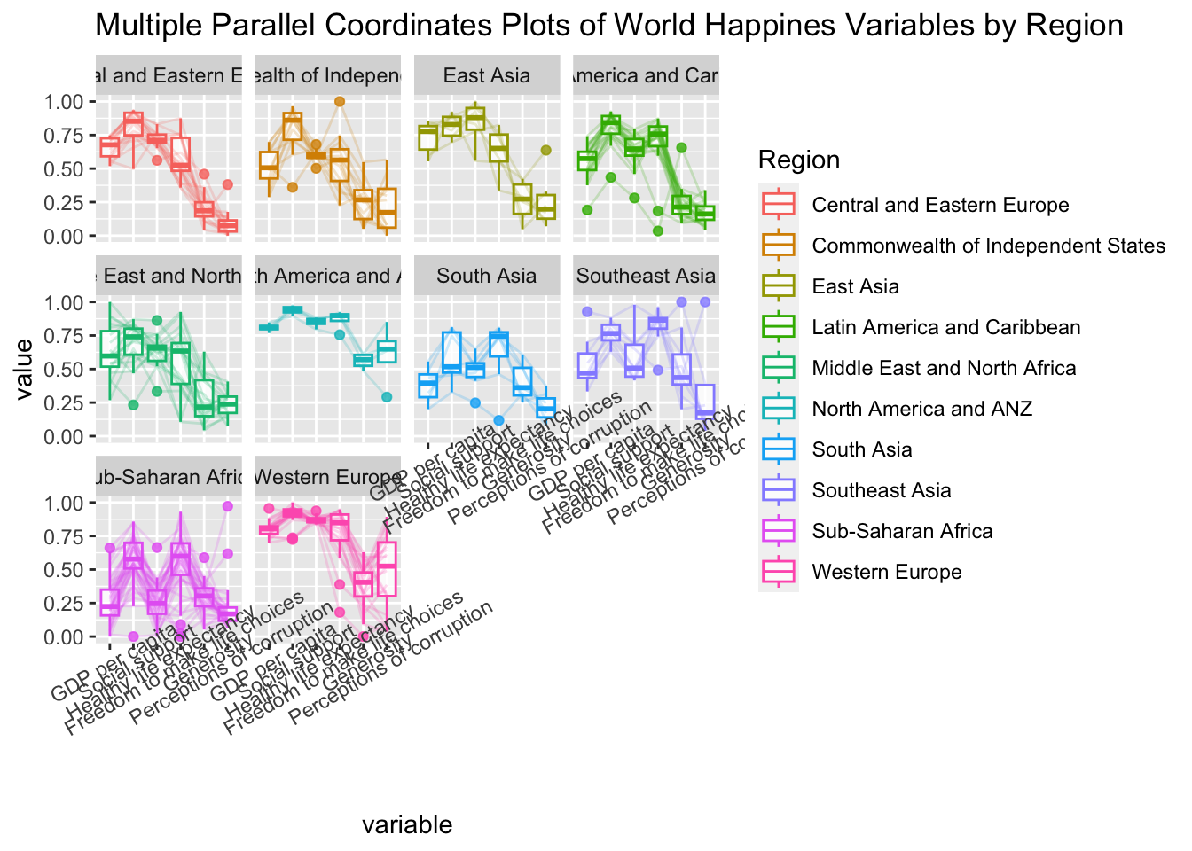
- To rotate x-axis text labels, we use
axis.text.xas argument totheme()function. And we specifyelement_text(angle = 30)to rotate the x-axis text by an angle 30 degree.
Adjusting the rotated x-axis text label
Rotating x-axis text labels to 30 degrees makes the label overlap with the plot and we can avoid this by adjusting the text location using hjust argument to theme’s text element with element_text(). We use axis.text.x as we want to change the look of x-axis text.
ggparcoord(data = wh,
           columns = c(7:12),
           groupColumn = 2,
           scale = "uniminmax",
           alphaLines = 0.2,
           boxplot = TRUE,
           title = "Multiple Parallel Coordinates Plots of World Happines Variables by Region") +
  facet_wrap(~ Region) +
  theme(axis.text.x = element_text(angle = 30, hjust=1))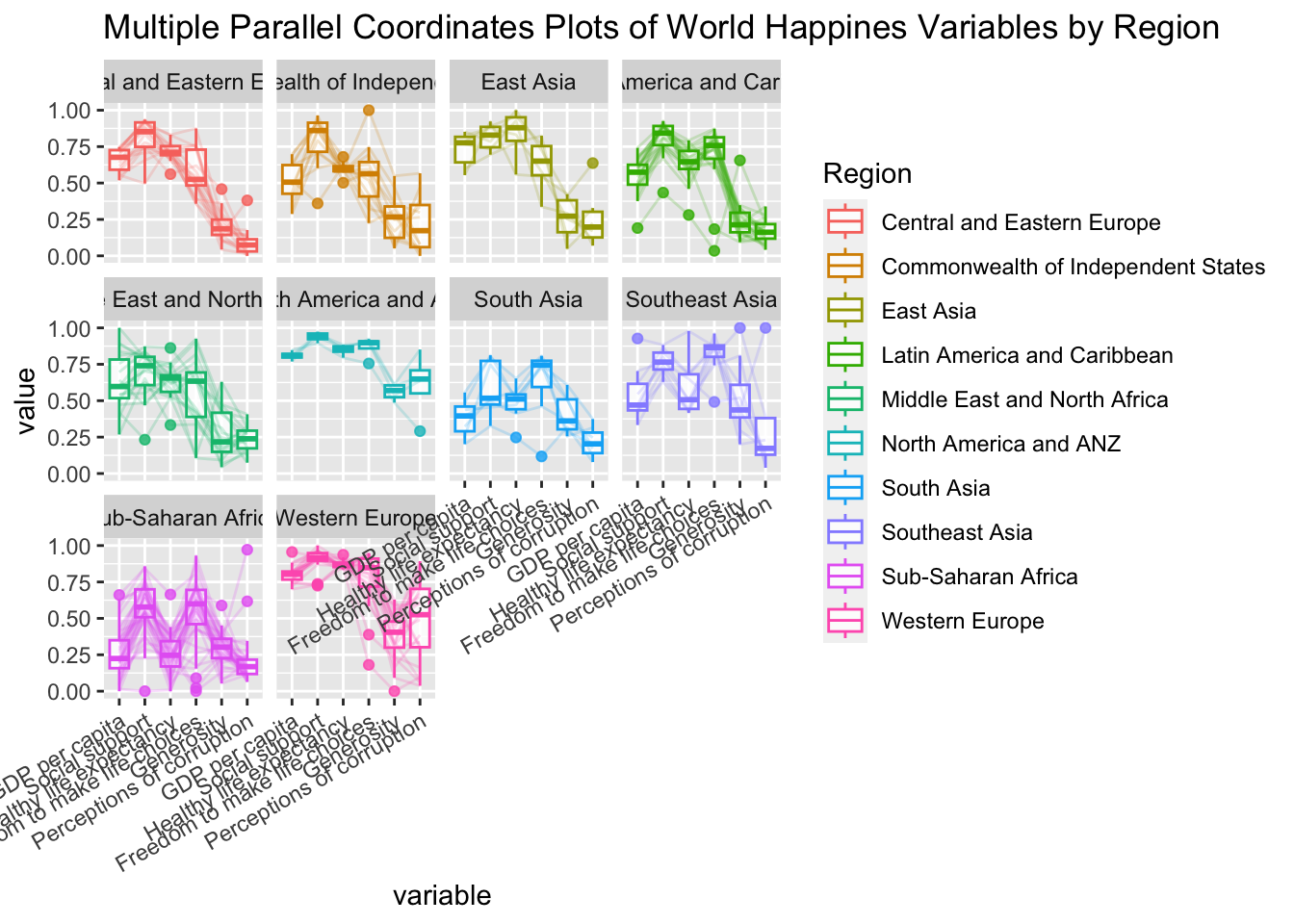
Plotting Interactive Parallel Coordinates Plot: parallelPlot methods
parallelPlot is an R package specially designed to plot a parallel coordinates plot by using ‘htmlwidgets’ package and d3.js.
The basic plot
wh <- wh %>%
  select("Happiness score", c(7:12))
parallelPlot(wh,
             width = 320,
             height = 250)
Rotate axis label
parallelPlot(wh,
             rotateTitle = TRUE)
One of the useful interactive feature of parallelPlot is we can click on a variable of interest, for example Happiness score, the monotonous blue colour (default) will change a blues with different intensity colour scheme will be used.
Changing the colour scheme
parallelPlot(wh,
             continuousCS = "YlOrRd",
             rotateTitle = TRUE)
Parallel coordinates plot with histogram
histoVisibility <- rep(TRUE, ncol(wh))
parallelPlot(wh,
             rotateTitle = TRUE,
             histoVisibility = histoVisibility)
References
ggparcoord() of GGally package